
Introduction
At some point, almost every marketing slide deck has flashed up the same bold line saying that the brain processes visuals 60,000 times faster than text. It sounds perfect for proving the power of design, and it neatly supports arguments about visual processing speed vs text. There is only one problem: no one can find the study that actually proves it.
That figure seems to trace back to a 1997 3M report, often referred to as the 3M visual processing study, that never shared any real research or method. The statistic then bounced around blogs, conference stages and LinkedIn posts until it started to feel like hard science. It is not. It is an internet myth that refuses to go away.
The good news is that the core idea is still right. Modern visual communication science shows that the brain processing speed for visuals really does beat text by a wide margin. Not by 60,000 times, but by something far more believable and still powerful. The realistic advantage sits between about 6 and 600 times faster, depending on what you compare.
This article walks through that real science in plain language, then turns it into practical moves for marketing leaders. By the end, you will understand how the brain processes images, why bullet points fail to fix presentation overload, and how a visual-first approach helps you build digital communities that actually care. Along the way, you will see how Iwi Digital uses visual thinking to cut through noise and make every second of attention count, so you can rethink presentations, email campaigns and social posts without adding more clutter.
Key Takeaways
The famous claim that the brain processes visuals 60,000 times faster than text has no scientific backing, even though it appears in many respected articles and slide decks. The measured difference in visual processing speed vs text is still huge, sitting in a realistic 6 to 600 times faster range, based on peer-reviewed neuroscience.
Visuals are not just about speed; they link directly into memory and emotion in ways text simply cannot match. Effects such as the Picture Superiority Effect and ideas from dual coding theory mean that when you combine simple words with strong imagery, messages stick for longer and feel more persuasive.
Old excuses about budget and time for visual content no longer really stand up. Modern image automation tools and dynamic templates mean personalised visuals can be created at scale faster than producing long text-only campaigns, turning a past barrier into a practical advantage.
Relying on dense text and long bullet lists in presentations and campaigns now carries a real cost. In an information-heavy environment, not prioritising visual communication means wasting the few seconds of attention people give, and missing chances to build trust with your audience.
Working with a partner such as Iwi Digital gives access to human-centred design, visual storytelling and digital tribe building expertise. That combination helps turn cognitive science into clear social content and digital experiences that your community can understand quickly and feel part of.
The Myth That Won't Die: The 60,000x Claim
The claim that “the brain processes images 60,000 times faster than text” has become a kind of marketing legend. It has appeared in articles from outlets such as Fast Company and TechCrunch, on agency blogs, and in countless conference talks. Once a number like that takes hold, it is tempting to repeat it, especially when trying to argue for more design budget or a slide light on copy.
When researchers went looking for the source, they found only a vague line in a 1997 3M document. That document did not present a study, did not share numbers, and did not explain how any comparison between visual processing speed vs text was made. Nothing in academic databases backs it up. At best, it was a sales claim. At worst, it was simply made up.
The same thing happened with the popular idea that “90 per cent of information sent to the brain is visual”. While it is true that vision takes up a lot of brain power, the exact percentage shifts with context, and no strong research fixes it at that neat round number. These sound bites work well in talks, but they sit on shaky ground.
For you as a marketing leader, repeating numbers like these is risky. It can damage trust when a sharp client or colleague starts asking where the data came from. The reassuring part is that the real science is still firmly on the side of visual communication. You do not need a magical 60,000x to argue for better design when proven research already shows a 6x to 600x advantage. That is the foundation the next section uses.
The Science Behind Visual Processing Speed: What Research Actually Shows

To understand visual processing speed vs text properly, it helps to start with the brain itself. The occipital lobe at the back of your head deals mostly with vision, while parts of the temporal lobe handle language. When information appears as both image and text, these systems can work at the same time, which gives visuals a natural head start.
From an evolutionary point of view, humans survived by spotting patterns fast. Being able to notice food, danger or an opportunity at a glance shaped how the brain works. That is why brain processing speed for visuals is so high; recognising a shape or colour pattern is what the visual system does all day.
Neuroscience backs this up. A study at MIT showed that people can recognise what is happening in an image in as little as 13 milliseconds. Earlier work reported in Nature found that people could decide whether a photo included an animal in under 150 milliseconds, even when the image flashed only briefly, highlighting the Speed of Processing in the human visual system. On the text side, research shows that identifying a single known word takes around 100–200 milliseconds, but reading for meaning is slower, at around 150–300 milliseconds per word.
That means a short eight-word sentence might take 1.2–2.4 seconds to read with understanding, while the idea inside a simple picture can land in 13–150 milliseconds. A longer 25-word sentence can take 3.75–7.5 seconds. When you compare these ranges, the realistic conclusion is clear. Images are processed somewhere between 6 and 600 times faster than text.
Here is a quick comparison to keep in mind:
Content Type | Processing Time | Example |
Single Image | 13–150 milliseconds | Brand logo, simple product shot, clear icon |
8-Word Sentence | 1.2–2.4 seconds | Short campaign tagline |
25-Word Sentence | 3.75–7.5 seconds | Small paragraph in an email or slide |
The numbers are less dramatic than the 60,000x myth, but they are solid, repeatable and more than strong enough for serious strategy work.
Why Your Brain Craves Visuals: The Cognitive Load Advantage

Speed is only part of the story. The deeper reason visuals beat text is cognitive load. Cognitive Load Theory explains how much mental effort it takes to process new information. Reading is a demanding process. Your brain has to recognise shapes as letters, group them into words, then build meaning from the sentence, all in strict order. That effort adds up quickly in presentations and reports.
Visuals work very differently. The brain is incredibly good at pattern recognition, and it does this almost instantly. When you see a simple line drawing of a house, you do not think of “four short lines, one triangle” and so on. You jump straight to “house”. Past experience does the hard work in the background. That is why, when you compare visual processing speed vs text, the visual wins by such a wide margin.
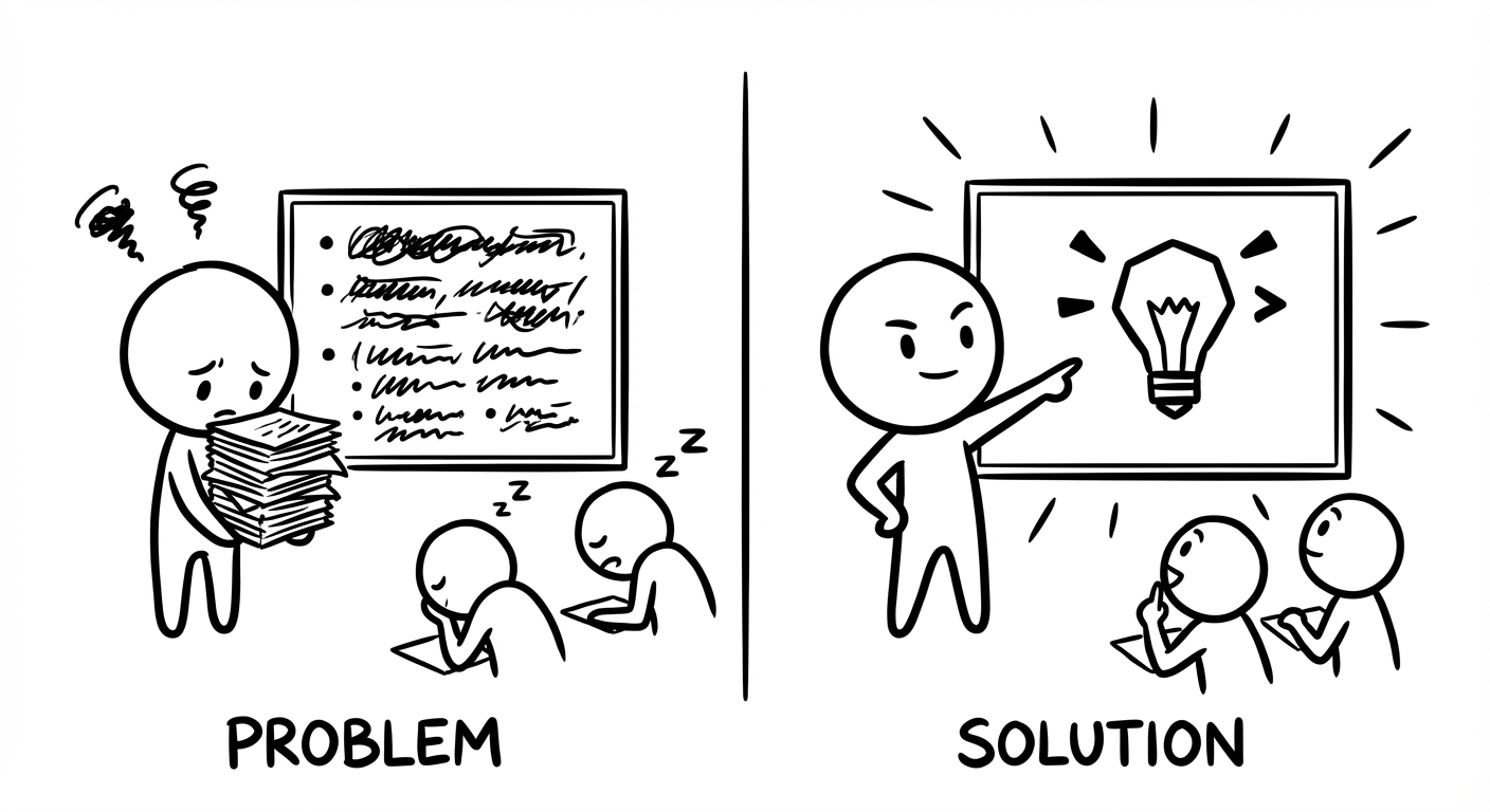
This matters because attention is already under pressure. When processing feels hard, people switch off faster. Dense text slides and long reports drain mental energy. Even when someone stays polite and looks at the screen, they may have stopped taking in meaning several slides ago.
It also explains why bullet lists often disappoint, even though they are supposed to simplify. From a Cognitive Load Theory perspective on presentations, bullets are still blocks of text, and research Exploring the impact of note taking methods on cognitive function shows that how we present information significantly affects mental processing. They may be shorter lines, but your audience’s brain still has to move word by word, line by line. This is why bullet points fail so often in real meetings. Replacing some of those bullets with clear diagrams, icons or simple sketches respects how the mind prefers to work and makes understanding feel easier.
"If you can't explain it simply, you don't understand it well enough." — Albert Einstein
Well-designed visuals reduce cognitive load, which means people can follow your story with less effort and remember more of what matters.
From Data to Insight: Visual Processing In A Data-Saturated World

Data volume keeps rising, but clear insight has not kept pace. Many teams sit on dashboards, spreadsheets and reports that are rich in numbers but poor in meaning. Domo has suggested that around 90 per cent of the world’s data has been created in just the last couple of years. No human mind can read through that much text and tables.
The market response supports this. IDC reported that visual data discovery tools are growing about 150 per cent faster than the rest of the business intelligence sector. That makes sense once you factor in visual processing speed vs text. If a decision maker can spot a pattern in a chart in half a second, but needs several seconds to read a written explanation, visuals are the obvious path.
Think of the classic example of a table versus a dashboard. If you had to count all the high-risk items in a big text table, your eyes would crawl row by row. Now imagine the same information as a chart where high risk is shown as red circles. You can see the red areas almost at once, even if there are hundreds of data points. That is visual communication science in daily action.
"Above all else, show the data." — Edward Tufte
The use cases run across the organisation:
Software teams use visual dependency maps to see which components hide security issues.
Finance leads look at trend lines instead of bare numbers.
Project managers track progress on clear Gantt charts rather than long task lists.
Marketing teams review visual funnels that show where audiences drop off.
When you help people see what matters faster, you help them act faster. At Iwi Digital, this same visual-first thinking guides how social content and digital experiences are shaped, so community members can understand and respond without effort.
Visual Communication In Modern Marketing: The Nine-Second Reality

Right now, attention in email is shockingly short. Research from Litmus suggests that the average person spends around nine seconds with a marketing email before moving on, and studies examining Paper versus Screen: Impact on reading comprehension confirm that digital formats present unique processing challenges. At normal reading speeds, that means they will take in perhaps 30–60 words. Yet another study found that the average marketing email runs to over 400 words. In many cases your audience is reading less than one fourteenth of what you carefully wrote.
In that context, visual processing speed vs text becomes more than an interesting fact; it becomes a design rule. To the brain, visuals are not decoration sitting next to “the real content”. Visuals are content. A strong product image, a simple diagram, or a sequence of icons can do more real communication in nine seconds than several paragraphs.
Stock photos rarely help. People have learnt to ignore generic smiling office scenes that say nothing about the message. What works better are purposeful visuals: icons that guide the eye across the screen, or a small animation that shows a product benefit rather than just saying “Learn more”. These use the brain’s speed with visuals in a smarter way.
For marketing directors and CMOs looking for a kind of PowerPoint alternative for leaders, this same approach can shape dashboards and stakeholder updates that tell the story visually instead of relying on dense slide text. This is the kind of practice Iwi Digital adopts when designing social content that respects limited attention and still builds community connection.
Beyond Speed: How Visuals Boost Memory And Emotional Connection
Fast processing is helpful, but the real test of communication is what people remember and how they feel. Here, visuals shine again. Psychologists talk about the Picture Superiority Effect, which shows that people remember pictures far better than words alone. When ideas appear as both simple text and image, recall days later is much higher. For brands, that means logos, colour systems and consistent visual styles become mental shortcuts that last.
"Vision trumps all the other senses. We learn and remember best through pictures, not through written or spoken words." — John Medina, Brain Rules
Emotion is another major factor. A photo of a frustrated customer, a hopeful crowd or a calm space hits feelings almost straight away. Text must first be read and understood before the emotion fully lands. Because so many buying decisions are guided by feeling, this faster emotional path gives visuals clear persuasive power.
Dual coding theory helps explain why mixed formats work so well. When you pair spoken or written words with clear imagery, the brain stores the idea in two ways at once. That makes the memory more stable and easier to bring back later. If a single picture can feel like a thousand words, then video, which adds sound and sequences of images, can feel like many thousands. For community building, that is gold. People remember stories they can both see and feel. Iwi Digital leans on these principles to craft visual stories that do more than inform; they help audiences feel part of a shared digital tribe.
Overcoming Implementation Barriers: Making Visual-First Communication Scalable
If visual content works so well, why is so much communication still text-heavy? Often the reasons given are practical. Design feels expensive. Teams worry they do not have enough time or specialist skills. Visual-first presentations sound great in theory, but slide after slide of bullet points somehow still appears.
Modern tools change this picture. Image automation and dynamic templates mean that once a strong visual format is in place, it can update itself with new data at scale. Think of it as the image version of mail merge. Instead of writing one email and swapping the name, you design one visual and let software change the product, date, price or location for each person.
The examples are everywhere:
A retailer can send each subscriber a visual that shows their most-viewed items and a timer counting down to the end of a sale.
A service business can send case studies where the industry, role and key result match each lead.
Event organisers can send confirmation messages that show an attendee’s chosen sessions in a simple visual schedule.
Studies have even found that this kind of automation can reduce total production time compared with making lots of separate static images.
At that point, the real question is not “Do we have the resources?” but “Can we afford to ignore this?” Given the 6–600x edge in visual processing speed vs text, every text-only campaign leaves performance on the table. Attention is the tightest resource in modern marketing. Iwi Digital’s human-centred approach starts from that fact, using visual thinking and social content design to make it easy for communities to stay with your message rather than drift away. For many teams, that is what makes visual-first communication feel realistic instead of out of reach.
Conclusion
Finding out that the famous 60,000x statistic is a myth can feel a little flat at first. Yet when you step back, a 6 to 600 times advantage in visual processing speed vs text is still extraordinary. No sane marketer would ignore a channel that worked even six times better, let alone hundreds.
The science shows that visuals win on speed, but also on memory and emotion. At the same time, real-world behaviour, such as the nine-second email reality, proves that you rarely have enough time for long copy to do its work. With the rise of dynamic imagery and visual automation, the old barriers of cost and time no longer stand in the same way.
Choosing a visual-first approach is not just a style choice. It is a sign of respect for your audience’s limited attention and mental energy. For digital community building, that respect builds trust. It says, “We value your time, so we make our message easy to see and feel.” Iwi Digital exists to help with exactly that shift, combining human-centred design, social content craft and digital tribe expertise.
You now have clearer science, practical examples, and a better way to think about visual communication. The next move is yours. Start by picking one upcoming presentation or campaign and asking how much of it could move from text into simple, purposeful visuals. The question is simple. Will your next presentation or campaign fight against how the brain works, or work with it?
FAQs
Question 1: Is The Claim That Brains Process Visuals 60,000 Times Faster Than Text True?
No. That line is an unproven marketing meme, not a scientific fact. It seems to stem from a 3M visual processing study reference in a 1997 report that never published real data or a research method. When neuroscientists compare visual processing speed vs text using real experiments, they find a range of around 6 to 600 times faster, depending on the task. That is still a huge edge, and more than enough to guide serious strategy.
Question 2: What Is Cognitive Load Theory And Why Does It Matter For Presentations?
Cognitive Load Theory looks at how much mental effort it takes to process information. Text-heavy slides push that load up because the brain has to move through each word in order, turning symbols into meaning step by step. Visuals reduce that strain because the brain can recognise patterns and shapes very quickly without the same level of effort. In Cognitive Load Theory presentation terms, lower load means better understanding and better recall. When you design slides that make strong use of diagrams, icons and simple images, people stay with you longer and remember more.
Question 3: How Long Does It Actually Take The Brain To Process An Image Versus Reading Text?
Neuroscience studies give clear ranges. Research at MIT showed that the brain can grasp the content of an image in about 13 milliseconds, while earlier work reported in Nature found complex image decisions taking under 150 milliseconds. For text, word recognition takes around 100–200 milliseconds, but full comprehension takes 150–300 milliseconds per word. That means an eight-word line can take 1.2–2.4 seconds, compared with 13–150 milliseconds for an image that expresses the same idea. In marketing, this means more meaning can be shared in the very short windows where your audience is paying attention.
Question 4: Why Do Bullet Points Fail If They're Supposed To Simplify Information?
Bullet lists feel simpler because they look shorter, but the brain still has to process each line as text. That means the same step-by-step reading effort as a normal paragraph. They cut down volume, but they do not really cut down cognitive load. This is one reason why bullet points fail so often to keep a room’s attention. If you add simple icons or small diagrams next to points, or turn key parts into visuals, people can see the structure of your message at a glance instead of reading every word.
Question 5: What Tools Can Help Create Personalised Visual Content At Scale?
Personalisation shouldn't mean more complexity. While enterprise platforms focus on "image automation," they often require heavy resources and data integration. Drawlah offers a more practical, visual-first alternative: the power of the digital doodle. Because the brain is physically allergic to bullet points and high-gloss corporate slides, a simple, hand-drawn sketch from Drawlah is often the only thing your audience will actually remember 72 hours later. Start sketching your solutions today and see how much faster an "Aha!" moment happens when you lead with your eyes.